CATEGORIES:
BiologyChemistryConstructionCultureEcologyEconomyElectronicsFinanceGeographyHistoryInformaticsLawMathematicsMechanicsMedicineOtherPedagogyPhilosophyPhysicsPolicyPsychologySociologySportTourism
The graph shows Underground Station Passenger Numbers in London. Summarise the information by selecting and reporting the main features, and make comparisons where relevant.
The graph and table below give information about water use worldwide and water consumption in two
Different countries.
Summarise the information by selecting and reporting the main features, and make comparisons where relevant.
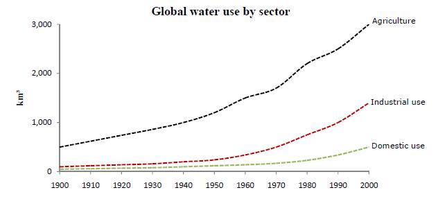
The graph shows how the amount of water used worldwide changed between 1900 and 2000.
Throughout the century, the largest quantity of water was used for agricultural purposes, and this increased dramatically from about 500 km³ to around 3,000 km³ in the year 2000. Water used in the industrial and domestic sectors also increased, but consumption was minimal until mid- century. From 1950 onwards, industrial use grew steadily to just over 1,000 km³, while domestic use rose more slowly to only 300 km³, both far below the levels of consumption by agriculture.
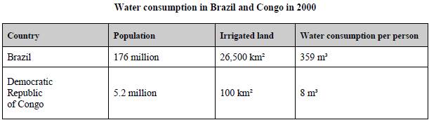
The table illustrates the differences in agriculture consumption in some areas of the world by contrasting the amount of irrigated land in Brazil (26,500 km³) with that in the D.R.C. (100 km²). This means that a huge amount of water is used in agriculture in Brazil, and this is reflected in the figures for water consumption per person: 359 m³ compared with only 8 m³ in the Congo. With a population of 176 million, the figures for Brazil indicate how high agriculture water consumption can be in some countries.
The graph shows Underground Station Passenger Numbers in London. Summarise the information by selecting and reporting the main features, and make comparisons where relevant.
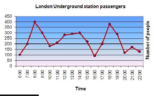
The graph shows the fluctuation in the number of people at a London underground station over the course of a day.
The busiest time of the day is in the morning. There is a sharp increase between 06:00 and 08:00, with 400 people using the station at 8 o'clock. After this the numbers drop quickly to less than 200 at10 o'clock. Between 11 am and 3 pm the number rises, with a plateau of just under 300 people using the station.
In the afternoon, numbers decline, with less than 100 using the station at 4 pm. There is then a rapid rise to a peak of 380 at 6pm. After 7 pm, numbers fall significantly, with only a slight increase again at 8pm, tailing off after 9 pm.
Overall, the graph shows that the station is most crowded in the early morning and early evening periods.

Date: 2016-03-03; view: 2243
| <== previous page | | | next page ==> |
| Different ways of asking someone to SHOW you something | | | Outstanding Scientists. |