CATEGORIES:
BiologyChemistryConstructionCultureEcologyEconomyElectronicsFinanceGeographyHistoryInformaticsLawMathematicsMechanicsMedicineOtherPedagogyPhilosophyPhysicsPolicyPsychologySociologySportTourism
Pepsi logo
 Pepsi-Cola is one of the most famous soft drinks consumed worldwide. Manufactured and marketed by PepsiCo, it was first developed and produced in the early 1890’s by Caleb Bradham, a pharmacist in New Bern, North Carolina labeled as “Brad’s drink”. In 1898, Bradham renamed his drink into “Pepsi-Cola”.
On June 16, 1903, the title Pepsi-Cola was trademarked and had since remained unchanged. But one aspect of Pepsi-Cola that witnessed many transformations over the years is the Pepsi logo. The Pepsi logo is one of the most famous and recognized logo design in the world.
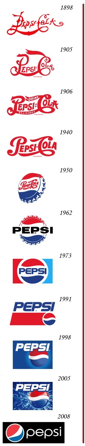
In 1898, Bradham used a scribbled logo script as the first Pepsi logo to brand the product. When his business got established and people started enjoying his drink, Bradham decided to modify the Pepsi logo into a more customized version of the previous logo script. Thus, in 1905, a modified script logo was introduced, followed by a second change in Pepsi logo in 1906 with the inclusion of the slogan, “The Original Pure Food Drink”, in it.
During the 1933’s sugar crisis, Loft Inc. bought Pepsi-Cola. As part of their marketing strategy, Pepsi-Cola doubled the quantity of its drink from six-ounce package size to twelve-ounces for 10 cents. Thus, the slogan “Refreshing & Healthful” was added to the Pepsi logo, which was printed on the bottle. When the price for the twelve-ounce bottle dropped to 5 cents, Pepsi-Cola reverted back to the old logo design.
The Pepsi Globe has its origins in the 1940s, when the United States was in World War II. To show support of the war, Pepsi unveiled a new bottle cap that featured the Pepsi script surrounded by swirling red and blue colors on a white background. Since Pepsi was recognizable with its script logo in the same manner as its main rival Coca-Cola at the time, the cap logo was simply meant as a show of U.S. patriotism as opposed to a marketing scheme.
The cap logo, however, quickly caught on, and by the end of the war in 1945 became Pepsi's primary logo. With Pepsi gaining ground on Coke in the 1950s, the logo became so recognizable that by the time the Pepsi logo was redesigned in 1962, the swirling "red, white, & blue" bottle cap that would eventually evolve into the Pepsi Globe would remain while the script was retired in favor of a more-modern "Pepsi" typeface.
The logo was updated again in 1973, when the typeface was made smaller as to fit in the white section of the Pepsi Globe. Meanwhile, the bottle cap itself was dropped and the Pepsi Globe was "boxed in", with a red bar coming in from the left and a light-blue bar coming in from the right.
In 1991, the logo was updated again, and for the first time in the half-century existence of the Pepsi Globe, no typeface of any kind would be in the white section of the Pepsi Globe on a regular Pepsi product. Instead, the red bar would be lengthened slightly (the light-blue bar was dropped altogether) and the Pepsi script was moved on top of the Pepsi Globe and red bar.
Later at the company’s 100 years celebration in 1998, Pepsi-Cola unveiled a new logo that symbolized the brand’s innovation and global recognition. The new Pepsi logo consists of a three-dimensional globe against an ice blue background, with the inclusion of the previously designed Pepsi typeface.
The design was refined in late-2002/early-2003 when the typeface was updated and the Pepsi Globe became more realistic-looking.
 In October 2008, Pepsi announced it would be redesigning its logo and re-branding many of its products. Pepsi, Diet Pepsi and Pepsi Max use all lower-case fonts for name brands, Mountain Dew has been renamed "Mtn Dew," and Diet Pepsi Max has been re-branded as Pepsi Max, because the original 1993 version is no longer available in the United States. The new imagery has started to be used. The new lower-case font used on Pepsi's products are reminiscent of the font used in Diet Pepsi's logo from the 1960s to the mid-1980s.
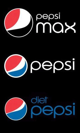
With the new packaging saw the Pepsi Globe get its biggest redesign since 1991 when the "Pepsi" wording was removed from the white area of the logo. The white area became a series of "smiles", with the central white band arcing at different angles depending on the product until mid-2010. Regular Pepsi has a medium-sized "smile", while Diet Pepsi had a small "smile". Pepsi Max's variant was the most different, using a large "smile" and also used black in the bottom half of the globe as opposed to the more standard royal blue. In July 2010, Pepsi Max began using the medium smile as it was redesigned to match the global branding. Pepsi Wild Cherry continued to use 2003 Pepsi design until late March 2010.
The new Pepsi design was unveiled in Canada in 2009. It was then released in other countries outside the US in 2010 such as France and the UK, meaning the 2003 design was phased out completely. In the UK, the current "smiling" logo features the globe in the center, and the "Pepsi" text below it, as opposed to the tilted text in the US.
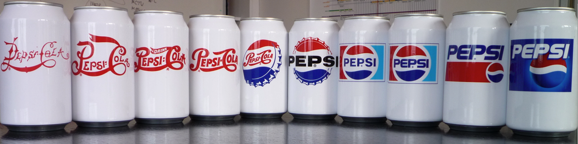
Over the past century, the Pepsi logo has been evolved into remarkable designs with significant modifications. All in all, Pepsi logo is an exemplary piece of creativity and innovation. No doubt, it is one of the most recognized logos.
Date: 2015-01-29; view: 5030
| <== previous page | | | next page ==> |
| Amazing facts. Check yourselves. | | | PERSONALITY OVER A LIFETIME |