CATEGORIES:
BiologyChemistryConstructionCultureEcologyEconomyElectronicsFinanceGeographyHistoryInformaticsLawMathematicsMechanicsMedicineOtherPedagogyPhilosophyPhysicsPolicyPsychologySociologySportTourism
Now compare your report with the sample answer
Commuting inside and outside London in 2009
The graphs show the time it takes employees to commute to their workplaces , and the mode of transport they use . Figures are given for both inside and outside London .
For the majority of the UK , the number of commuters decreases as commuting time increases . Almost half of the commuters take less than 15 minutes to get to their place of work , while only around 3 percent spend over an hour commuting . Indeed , three quarters of commuters outside London reach work within half an hour . In London , the trend is very different . The figures show that it takes much longer to get to work . Less than half of the commuters have reached work within half an hour , with the percentage reaching work in less than fifteen minutes significantly lower than the percentage reaching work in thirty minutes . Moreover , forty percent of people spend up to an hour commuting , with an equal proportion in the 30-45 minute bracket and the 45-60 minute bracket , and a further sixteen percent commute for over an hour – over five times the proportion outside London .
Regarding the mode of transport , the car is dominant both inside and outside London , significantly so outside London , where other modes of transport account for less than a quarter of journeys . Of the other modes of transport , walking and taking the bus are more common than cycling , taking the train and using the underground . Inside London , the car accounts for about one third of commuting journeys . However , public transport is used for about half of the journeys , the train and underground being more popular than the bus.

| Exercise 8. WRITING TASK |
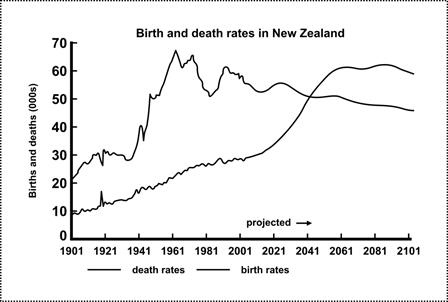
The graph below gives information about changes in the birth and death rates in New Zealand between 1901 and 2101. Write a report for a university lecturer describing the information shown below. Write at least 150 words. Compare the two sample answers


| Exercise 9. Write a report for a university lecturer describing the information shown below. |
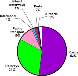
The table below shows CO2 emissions for different forms of transport in the European Union. The Pie Chart shows the percentage of European Union funds being spent on different forms of transport.

| 
| ||

| Exercise 10. It’s your turn now. Describe a graph or of your own. Try to use words and phrases from the text above to present the visual. | ||

| Exercise 11. Check yourself using the information from the table below. | ||
| Put a tick | CHECKLIST FOR USING VISUALS (GRAPHS & CHARTS) | ||
| l. Make your visual as clear and easy to understand as possible. | |||
| 2. Start by telling your audience what the graph/chart illustrates. | |||
| 3. Highlight the key points. | |||
| 4. Say why these points are important (and explain the cause or effect). | |||
| 5. Use different verbs to express movement/development | |||
Date: 2016-04-22; view: 1893
| <== previous page | | | next page ==> |
| Comprehension of Visual presentations | | |