CATEGORIES:
BiologyChemistryConstructionCultureEcologyEconomyElectronicsFinanceGeographyHistoryInformaticsLawMathematicsMechanicsMedicineOtherPedagogyPhilosophyPhysicsPolicyPsychologySociologySportTourism
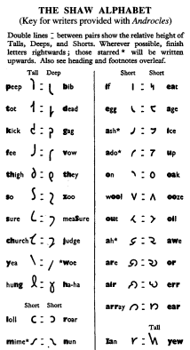
The Shaw Alphabet in print and typewriting.A month later, on 18 August, I brought to London the finished Shaw Alphabet. It was fully discussed with Mr Pitman and with Mr J T Harrison (of Stephen Austin and Sons, Hertford, who produced type and printed Androcles) and it was adopted by the Trustee. I then proceeded to make the die-cutting drawings - 30 times print size - in three distinct styles required for stage directions, the names of speakers, and the dialogue. Mr MacCarthy was by this time transliterating the play while on secondment to Lahore University, Pakistan, and a good deal of printers' proof revision fell to me. New and old versions of the play were printed on facing pages, matching exactly line for line, without either over-running the other. The task of securing tolerable typographic spacing was not easy. An edition of 40 000 paperback copies was issued commercially by Penguin Books Ltd. Their refinements of typography in the orthodox version inspired me to emulate it in the new alphabet. Our joint result was chosen as one of the National Book League's 'best printed books of 1962'. Apart from this Penguin commercial edition, the Trustee distributed gratis to all Head Public Libraries of Britain, the Commonwealth, North and South America, and to all National Libraries of the world, a total of some 13,000 hard-back copies which should still be available. [4] The Shaw Alphabet itself, and both editions of Androcles, were published on 20 November 1962, with a press conference and publicity on television. No-one needs to know the new alphabet to see immediately that Androcles demonstrated a marked economy; for the lines of its orthodox text are exactly 50% wider than matching lines in the Shaw Alphabet. Normally, line-widths would not be shortened; but books in the new alphabet would occupy one-third fewer pages, using that much less type and ink; they would be lighter for handling, transport and shelving, and a good deal cheaper. Questioned in the press conference as to cost, Mr Harrison replied that his type-cutter and type-setter had used no unusual procedure or machine. Except for its novel letters, it was a perfectly normal type, normally printed. It is also immediately clear that the new letters are consistent in their sound-writing. As to the economy in printing, rather less than half of it comes from single-letter representation of single sounds - ie from avoiding digraphs; more than half comes from simpler and narrower lettering. Since that day, it cannot be said that alphabetic economy is technically 'impossible' - or even difficult. The fait accompli proves Shaw's point. A transliteration of part of Lincoln's Gettysburg address exhibits good typography in the Shaw Alphabet. An article on the new typography was commissioned by Indian Print and Paper, a Calcutta trade journal. For my part I was determined to carry the accomplished evidence further - further than the Will specifically required. Throughout 1962 I had been preparing plans for a Shavian type-writer, and on propaganda grounds the Trustee accepted quotations obtained from Imperial Typewriters Ltd, Leicester. The special letters were cut for around £70 and thereafter a normal portable machine (44 keys, 88 characters) was available at the current catalogue price of £29. The Trustee provided Mr MacCarthy and myself with the first two such machines. The keyboard not only carried the Shaw Alphabet, numerals, punctuation marks and sundry signs: it retained 26 Roman capital letters for orthodox addressing of envelopes. I used my Shavian typewriter to produce a quarterly journal called Shaw-script; for correspondents sought more reading practice than Androcles gave them. The original typescript was reduced and offset printed by Rank-Xerox Ltd, Birmingham.
Date: 2015-01-29; view: 1307
|