CATEGORIES:
BiologyChemistryConstructionCultureEcologyEconomyElectronicsFinanceGeographyHistoryInformaticsLawMathematicsMechanicsMedicineOtherPedagogyPhilosophyPhysicsPolicyPsychologySociologySportTourism
Know The Principles of Effective Logo DesignNow that you know what a logo is supposed to do, and what it should represent you now must learn about what makes a great logo; the basic rules and principles of effective logo design.
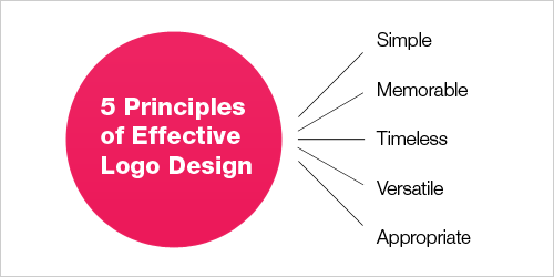
Successful Logos Now you know what the rules of logo design are, you can distinguish the difference between a good and a bad logo… By knowing what other logos have succeeded and why they have succeeded gives a great insight into what makes a good logo. For example, let’s look at the classic Nike Swoosh. This logo was created by Caroline Davidson in 1971 for only $35 yet it still a strong, memorable logo, effective without colour and easily scalable. It is simple, fluid and fast and represents the wing in the famous statue of the Greek Goddess of victory, Nike – something perfect for a sporting apparel business. Nike is just one of many great logos. Think about other famous brands that you know about and check out their logos. What makes them successful? The Principles of Effective Logo Design Simple Simplicity makes a logo design easily recognizable, versatile and memorable. Good logos feature something unexpected or unique, without being “overdrawn.” Memorable Following closely on this principle of simplicity is that of memorability. An effective logo design should be memorable, which is achieved by keeping it simple yet appropriate. Timeless An effective logo should be timeless. – that is, it will stand the test of time. Will it still be effective in 10, 20 or 50 years? Versatile An effective logo works across a variety of media and applications. For this reason, logos should be designed in vector format, to ensure that they scale to any size. The logo must work in just one colour too. Ask yourself, is your logo still effective if it is printed… In one color? In reverse color (i.e. light logo on dark background)? The size of a postage stamp? As large as a billboard? One way to create a versatile logo is to begin designing in black and white. This allows you to focus on the concept and shape, rather than color, which is subjective in nature. Also keep in mind printing costs: the more colors you use, the more expensive it will be for the business over the long term. Appropriate How you position the logo should be appropriate for its intended purpose audience. For example, if you are designing a logo for children’s toys store, it would be appropriate to use a childish font & color scheme. This would not be so appropriate for a law firm. You have to take a number of factors into consideration when designing a logo, such as how many logo concepts need to be presented, how many revisions will be needed, how much research is required, how big the business is and so on. A logo doesn’t need to say what a company does. The Apple logo isn’t a computer. The Mercedes logo isn’t a car. Date: 2016-01-14; view: 1096
|